2D practice- Development + Resolved piece

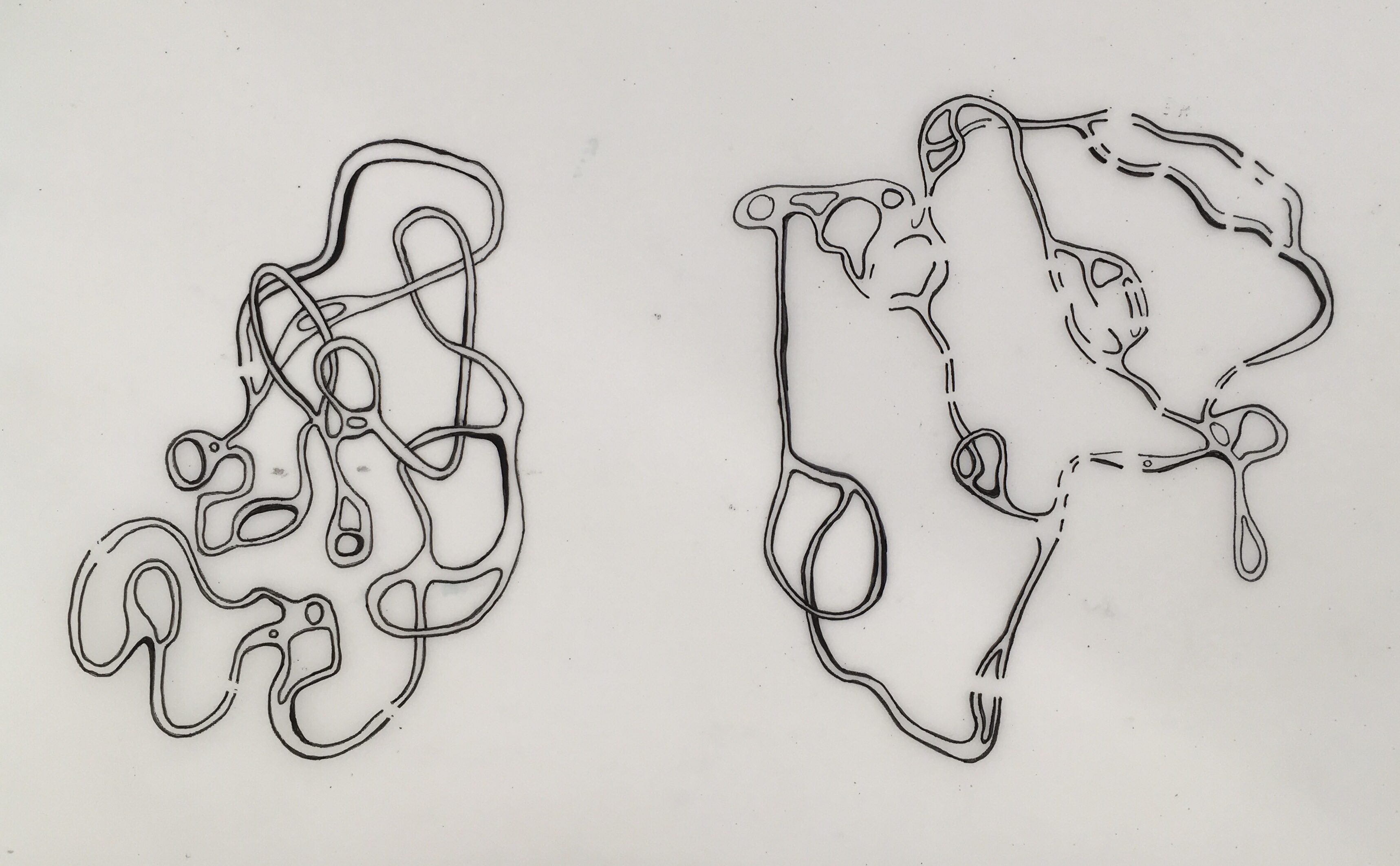
I planned to carry on the worm like patterns in the prints but use paint to create them on a piece of wood instead. I learned from the weeks prior that my most effective ay of working was to not have a plan and just let it happen, i picked oil colours for this one as i could work into them for longer. i let this piece be influenced by all of the development, using parts of my favourite outcomes. Overall i like this piece however it lacks depth and feels quite design like and obvious instead of hold that mystery that im searching for.

The next piece i decided to plan out a bit more.

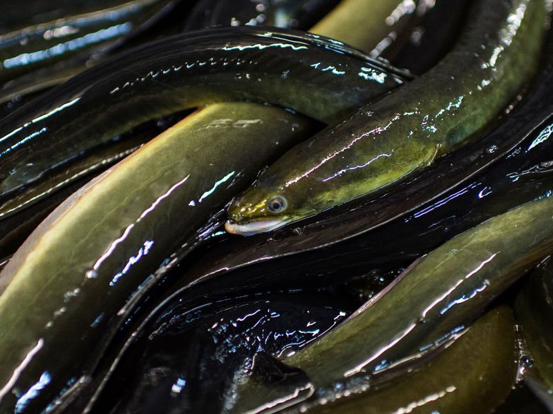
Inspired by Mathais Weischer i wanted to involve the illusion of turning a corner, i didnt want it to distract or be the main focus, however. the best way to do this was simplify it using a blocked out section, i did this with oil bar because i like the slightly rougher texture and that you can see the dark colour form underneath pulling through. i feel this section strengthens the composition. the next step was adding the squirming eels, i felt like if i just painted on top it would look flat so i scratched into and dragged out the oil bar. the next step was to incorporate the patterns ive used throughout because i feel they tie to a variety of imagery that fits my theme. i started painting in yellow acrylic but its didn’t stand out enough and looked to still and print like.

Ive chosen this Piece as my resolved work , i feel it is compositionally the strongest, it has depth and draws the eyes easily. i also feel it still displays the ideas and atmosphere i was trying to achieve. the dark background creates a space of nothingness, an eerie feeling, like something could be hidden by the blanked out corner. The flesh tones with yellow peeking through suggest something gory or gross, like veins, intestines or parasites. The eel like shapes tangled in, posses a confusion, your eyes try to follow the lines of each around getting tangled whilst trying to make sense of it. I am pleased that this work achieves the goal of not attaching itself like anything to specific whilst still sparking familiarity, you can recognise the shapes but they are placed in an unfamiliar setting. It is unsettling and requires you to take a few looks before deciding what it could be.

2D practice- collage

Collage allowed me to manipulate the context of an image which can produce confusion about what its is you are looking at. The red blobs are melting sorbet but when placed in a different setting it looks more alien like something emerging and taking over the space, the slimey red image creates a feeling of discomfort and need to figure out what is going on. I juxtaposed this with quite calm environments which emphasises the feeling that the red blob takes over.

i decided to use one of the print bases i had made to incorporate print together with collage. The collaged shapes are made up of a sponge cake, this triggered my fear of small holes so felt it was perfect, i know that often people with out the fear still feel uneasy looking at that kind of pattern. i aimed to replicate the accidental shapes in the print which ended up tying the two together well.

Continuing the patterns and drawings i have used before, if found this holey shape in a magazine that replicated what i had done before. it furthers the alien look of the first collage, a peaceful scene interjected by colours of fear and an unidentifiable shape. i particularly like the rubbed out picture with red lines running through, i did this by accident not expecting the picture to rub out but it ended up tying together well because i often stay away from the blockiness of collage.

Overall i am pleased by the outcomes of collage, however i will aim to be less precious in the future as i feel i took too long thinking it over instead of making full use of the freedoms collage can give. i prefer the idea of combing collage with other mediums so i plan to carry it on in the future.

2D practice- Print

Print week began with screen printing, using the photo emulsion technique. My work lends itself well to printing as the imagery is quite blocky so easy to recreate onto the screen. I decided to use my initial drawings to transfer as the were delicate so I thought it would look good combining it with other mediums. It took quite a few attempts to print the drawings the right way so I have lots of excess starting points to work with.

I decide to thicken the lines a little with pen as I was worries it would pick up well enough. 

The first attempt didn’t work out how I expected, the lines aren’t strong enough and I didn’t mask off the edges, hence the mark on the right. After discussing with the lecturer I started to see how actually the disappearing lines could be a positive thing when combining it with other mediums or strengthened in other ways. We also talked about how the accidental mark could add to the piece compositionally. lots to think about and developments to be made.

Feelings disheartened by my failed? Attempts I used the time to prepare surfaces instead.

The first one accidentally produced some parasite like shapes which I intend to work into later. In all of these prints there are slight imperfections which I think are quite strong and with support other mediums well.

I moved onto Lino printing, I picked the eels coming out of water as the first one to cut into Lino.

I felt the first print was to illustrative and lacked depth or even any resemblance to eels in water. I decided to break them up by folding and scrunching the paper I printed them on to. I feel this look fits the theme well as the broken pieces reminds me of piecing together bits of information like a jigsaw. i moved on to the imagery from my original drawings.

Again i wasn’t fond of the blockiness of the print and wanted to break it up so decided to paint on the ink. This outcome had no mystery to it so i moved on to mono-printing.

i much preferred the look of monoprint, its a lot more subtle and leaves more to be discovered. the red ink looked creepy and speckled which holds connotations of fear and the unknown. i also noticed in the picture above that there was a slight print of what i had previously scratched into the ink plate, this gave me the idea to use the lino cut to pick up another layer.

This produced the feeling i was going for, the monoprint breaks up the lino print, forcing your mind to piece the rest together. i could perhaps create a series of these slightly changing to create a squirming, pulsating movement.

Yayoi kusama

Born in Matsumoto, Japan 1929, kusama is known for her obsessive repetitive paintings. she engaged in very little formal training only studying for a year in 1948 at the Kyoto city specialist school of arts; very few pieces of work from this time still exist as she destroyed much of the early stuff. she brought her work to new York with a desire to become and artist in 1957.

her work began out of a use of patterns and mark making as a therapy for her, endless repetition mimicking that of her hallucinations; this however predicted the minimalist movement and pop art. The work mimics the patterns and shapes you will find in nature, realising how similar we all are in our biological make up.

The kaleidoscopic organisms repeated gives us a feeling of insignificance, they are endless unlike us. Human brains work by recognising patterns and making an observation to inform our actions ; I feel this could feed into my theme and perhaps create fear with the repetition of inexplicable movements. her paintings replicate the process our minds go through when presented with fear, at first it seems bold and uncompromising yet with repetition the impression of danger is overcome or realised as unthreatening.

Matthais Weicher

Born in west Germany in 1973, and moved east to study painting at Leipzig’s Academy of visual arts in 1995, receiving his Masters in 2003. he began to study under David Hockney. he co food the LIGA gallery led by artists in Berlin.

his paintings morph reality and imagination, abstract and figurative, he explores deserted three dimensional spaces. he constructs these spaces with paint to build up a room often disregarding the rules of typical perspective. This perspective is inspired by Hockney, altering what is expected by the viewer, placing focal points slightly off. It involves the viewer into the painting, feeling party of the open inviting space.

I was particularly intrigued by this piece ‘Corner’ 2005, it feels eerie mysterious. the dark colours in the centre draw you in , it feels like you are about to turn a corner anticipating what’s about to come. Thick paint creates intense depth with coulees like dried blood peeling off the edges.

Many of his paintings provide an atmosphere apprehension like there is something we don’t know, perhaps more to the story. A dark corner, shadows under the dest, ambient lighting it feels like a stage before performance; something is yet to come.

Pia Fries

Born and raised in switzelrsnd in 1955, she attended the Lucerne school of art to study sculpture in 1980. She then moved to dussledorf to study painting under the well known artist Gerhard Ritcher, acknowledged for his prominent use of alternative tools e.g squeegees. This use of tools an sweeping movements carries through to her work, layering thick paint with handmade or repurposed tools. Much of her work presents as completely inexplicable yet they make sense visually to the viewer. Her playfulness Comes through with the piles of colourful paint slathered onto a white back ground, strengthening the organic shapes. I find her work charming, it is clear that the incomprehensible movements show her search for her own visual language.

unidentifiable bodies of colour feel familiar, they represent something we would find in nature. they just exist and that is enough in itself to send you mind spilling. this Is what drew me to her work, abstraction purely from subconscious justifying itself. it influences me to stop finding. reason for every mark I make and seeing where the appreciation and development of movements takes me.

she uses collage and print to bring in slightly contrasting focus points to her mysterious smears of expression. she was particularly influenced by etchings but Hendrick Goltzius using found images to print into her work but also drawing inspiration from their peculiar, bulbous muscles and exaggerated strength to inform her movement of lines.

Ellen Gallagher

An American printer, painter and collagist born in 1965, working in Rotterdam and New York. Her work fixes on the sense of otherness being born in America but of Scottish and African decent. Having a biracial identity fuels much of her work by exploring stereotypes predominantly for African American. A portion of her student years were spent on a marine research vessel, studying and drawing on the mysteries of the sea supporting her fascination of microscope life and oceanography. I was drawn to her work because of the themes she explores as my project is partly focused on the desire to know the depths of un answered questions- the sea is a source of inspiration with al th odd creature that are essential to our ecosystem and the exploration of newfound areas. Her themes knit together with her ongoing project titled ‘Watery ecstatic’ combining her knowledge in the marine world and exploration of the myth of Drexciya; an underwater world built up of the unborn babies of pregnant African women that were thrown off slave ships who adapted to breath underwater and survive.

From a distance you can see delicate swirling water colours, an abstract underwater botanical scene yet up close you are hit with something darker and harder when you discover the small stereotyped black faces ,mimicking minstrel images, stuck to the paper.

Gallagher also explored minimalism through her collages, heavily inspired by Agnes Martin. Involving grid formations and minimalist geometry, it emphasises a sense of power and order binding together her many themes by repeating patterns throughout. ‘Paper cup’ is a large scale canvas layered with sheets of paper lined and imperfectly arranged in rows leaving the paper to wrinkle. Upon closer inspection, the same racist Minstrel faces appear .

2D Project- painting/markmaking

I began by exploring how easily people can be convinced so easily by something that may turn out to be illogical or false. It lead me to the need we have for an answer, how we don’t feel comfortable leaving something as a mystery. I looked into the psychology behind beliefs and came up with a mind map of research to feed into a feeling I want to portray.

Summed up, this mind map realises that it is our natural instinct as a way of protecting ourselves to search for patterns, learn by imitation and infer intentions. Our subconscious tells us to constantly make observations and fixate on the negative or dangerous as they pose the threat that we could avoid or fix. The unknown is the most natural fear, so we turn towards it and dig to reduce the threat. I plan to reproduce that feeling through the work I make so came up with a (still growing) mind map to discover how to do so.

The word ‘Writhing’ particularly popped out, it motivated to think more visually about the movements of 2d work. I produced two drawings of what I feel that would look like.

These drawings reminded me of blood vessels/nerves/bodily tissues, something verging on grotesque. I plan to use these style of drawings further into the project. As well as I feel they represent the word writhing well, I don’t feel like I have any supporting imagery to branch off from; these images were more like doodles form my head rather than something of substance. I began to look fro imagery to work from.

Eels are one of my fears yet I find them oddly endearing and beautiful, so I thought it would help fuel the concept. I think the way they squirm over each other is mesmerising, it reminds me of how people can get tangled up in knots trying to make sense of something inexplicable. I began with drawings of the subject.

We received a workshop on stretching paper, priming and using wet materials eg. bleach, ink, paint. I used the eel imagery to carry further as a starting point.

I noticed that a lot of my work just feels like a background or pattern and not much thought has gone into composition, I’m struggling to find objects for focus. Playing with the wet materials helped me gain a feel for them however, I don’t particularly like any of the pieces, they seem incoherent and irrelevant to my theme. it was perhaps limited due the time it took to stretch the paper which made me precious about it. I started painting on cardboard instead.

i like the textures created by ink and bleach to replicate the patterns of eels. I was particularly by the last one, i used wet emulsion and scratched into it with different tools, it reminds me of looking through a microscope to subtly squirming organisms. Starting to like my work, I felt motivated to relax and produce a larger piece.

I like the subtlety of the oil bar being dragged to the right and strengthened by the red pencil. however the outline could be bolder. I feel it really represents the word writhing but it is a bit too gentle to look at, there is no question of what it is or reluctancy to look at it. the composition is a little confused, I can’t see any strong focal point. there is lots to work off but it has successfully fuelled me further.

Two pieces of stretched paper failed so i decided to use them for excess paint and material i had, to see what comes of it.

The composition of both are a mess however they could be useful as prepared textured surfaces or as a practice for techniques. i like the cracking on the left one, its seems to be in the process of revealing something, presenting a mystery.

We then learnt a new technique, using the printers various settings to alter the colours or print onto alternative surfaces. i ad a couple attempts at this but am yet to use it to full potential.

i attempted to combine techniques iv’e learnt throughout this week onto one piece. i carried on the idea of scratching/peeling away paint to reveal i picture printed on acetate.

the composition needs a bit of work, but i like the idea of the peeled away areas, as well as the texture of the oil bar.