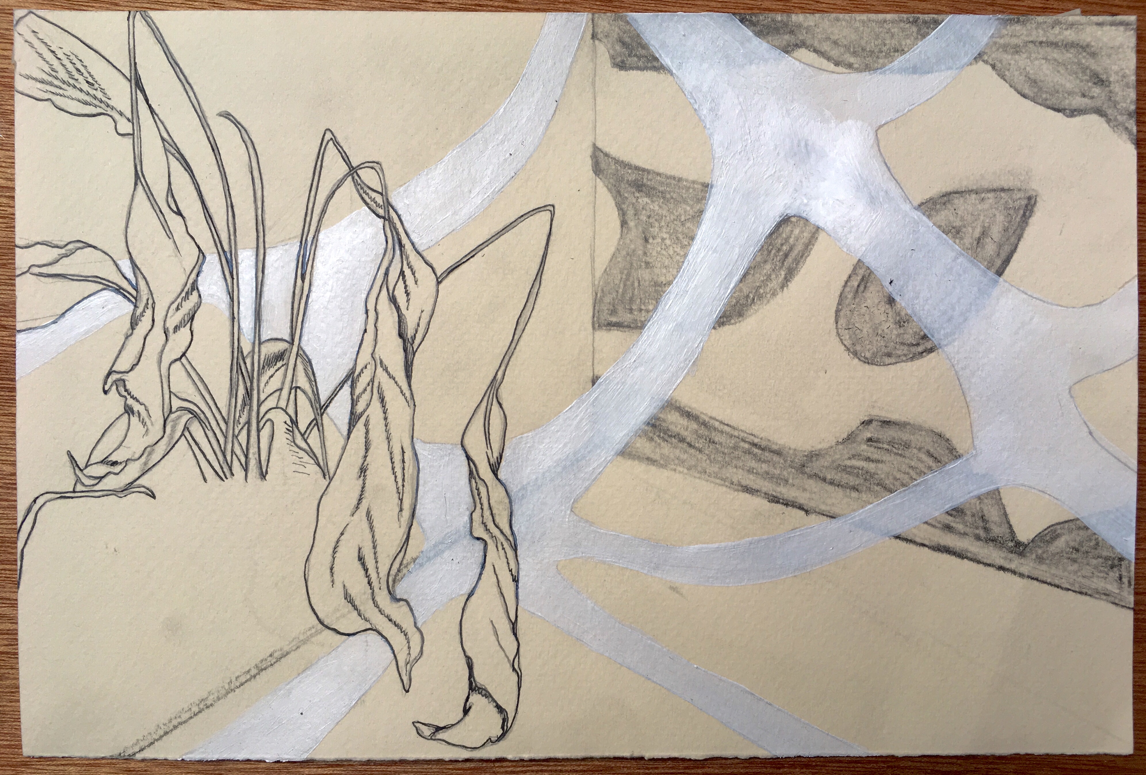
DEVELOPMENTAL DRAWING – WEEK 3

I feel like these four resolved drawings are a good impression of my explorations over the weeks and highlight my favourite techniques and happy accidents.

  • In the first drawing i first focussed on what my surface could provide, allowing me to use the negative space for the right tone and blanking out around it with white. i like this technique for the texture of it and enjoyed working on wood. i continued on imagery and shapes from previous drawings and composed them in other ways. i like the pink pencil and ink drawings separately but i could have layered them differently because they are quite distracting and the focal point is confused. i think i could work into this more by using white paint to blank over areas which might highlight the pink.
  • The second drawing where i explore 3d drawing might be my favourite, i loved pushing drawn organic lines into a structured 3d space and using pencil to highlight the shadows. However, the execution isn’t perfect, it was pointed out in a crit that although it look interesting in a photo it probably doesn’t in person. i agree but i think that there are so many ways around this, using other materials and spending more time. There could also be the argument whether it is a drawing, 3d or relief but i like that it showed me to question at what point something becomes a drawing.
  • The third drawing focusses on different shading methods, i like how i can use repetitive lines as shade and blank as start highlights. i like the effect of the clear oil pastel on the paper, i wish i had taken this further to see what else i could do with this technique. i still cant decide whether this drawing is too simple and i should have carried on, something feels incomplete about it- it might be because i hold back on creating such dark lines, maybe i should have made the shading bolder for a more interesting outcome.
  • The last drawing focussed on the composition, i like using negative space and zoomed in sections of a subject as the inspiration for this work. there are lots of elements from previous drawing in this, such as the croner shape of a room and the incomplete plant- this was quite well thought out in comparison to the others i considered every aspect before hand. i think this heavy consideration can limit a drawing, i would have like to see a more interesting background or texture in the blank spaces. you can see the paper in most of my drawings, going forward i want to create more interesting surfaces to work on.

This drawing week has really benefited my understanding of what a successful drawing can be. i feel more confident now to be able to use it in all of my practice as a base and as something to resort back to when stuck. Moving away from a focus on concept has reminded me of what can be done with materials and composition.

Developmental Drawing- Artist Research

Marianne Eigenheer

– Marianne Eigenheer (20 April 1945– 15 January 2018) was a swiss artist whose focus was in drawing, she worked also as a professor and lecturer at various art colleges and academies. As a child in the 50s she received piano lessons and grew her love for music, she wanted to be a pianist and composer. However this was not possible and she focussed this energy into drawing and painting.
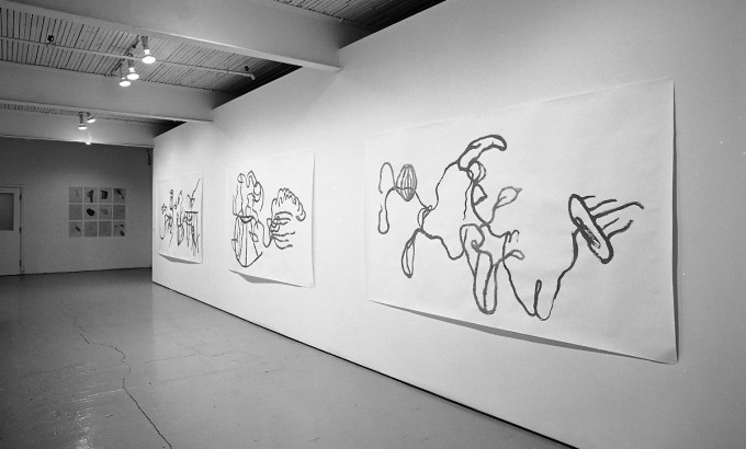
– I feel her roots in music influence her work, the decisive lines remind me of the movements of a conductor’s baton. These movements varying in intensity and path.
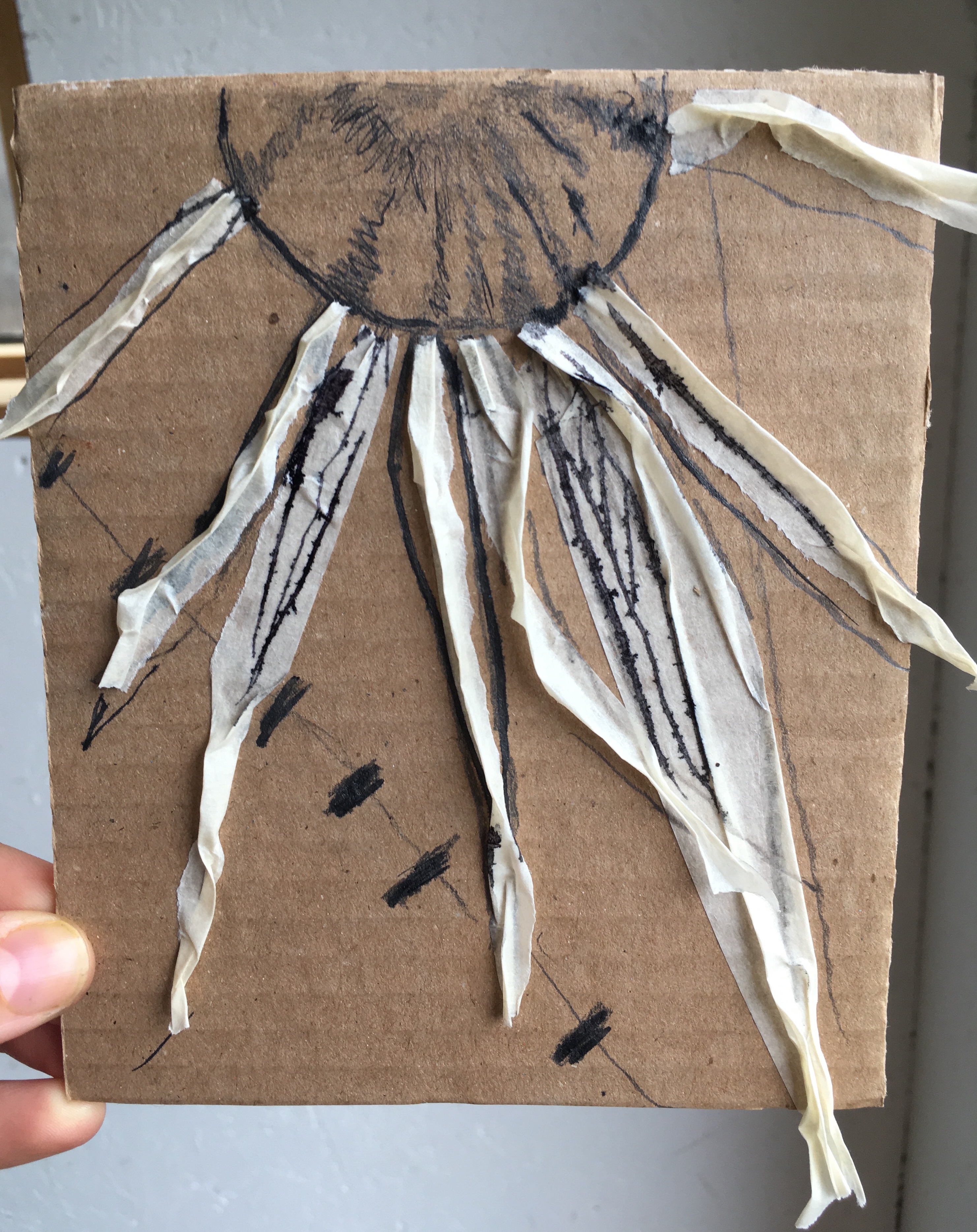
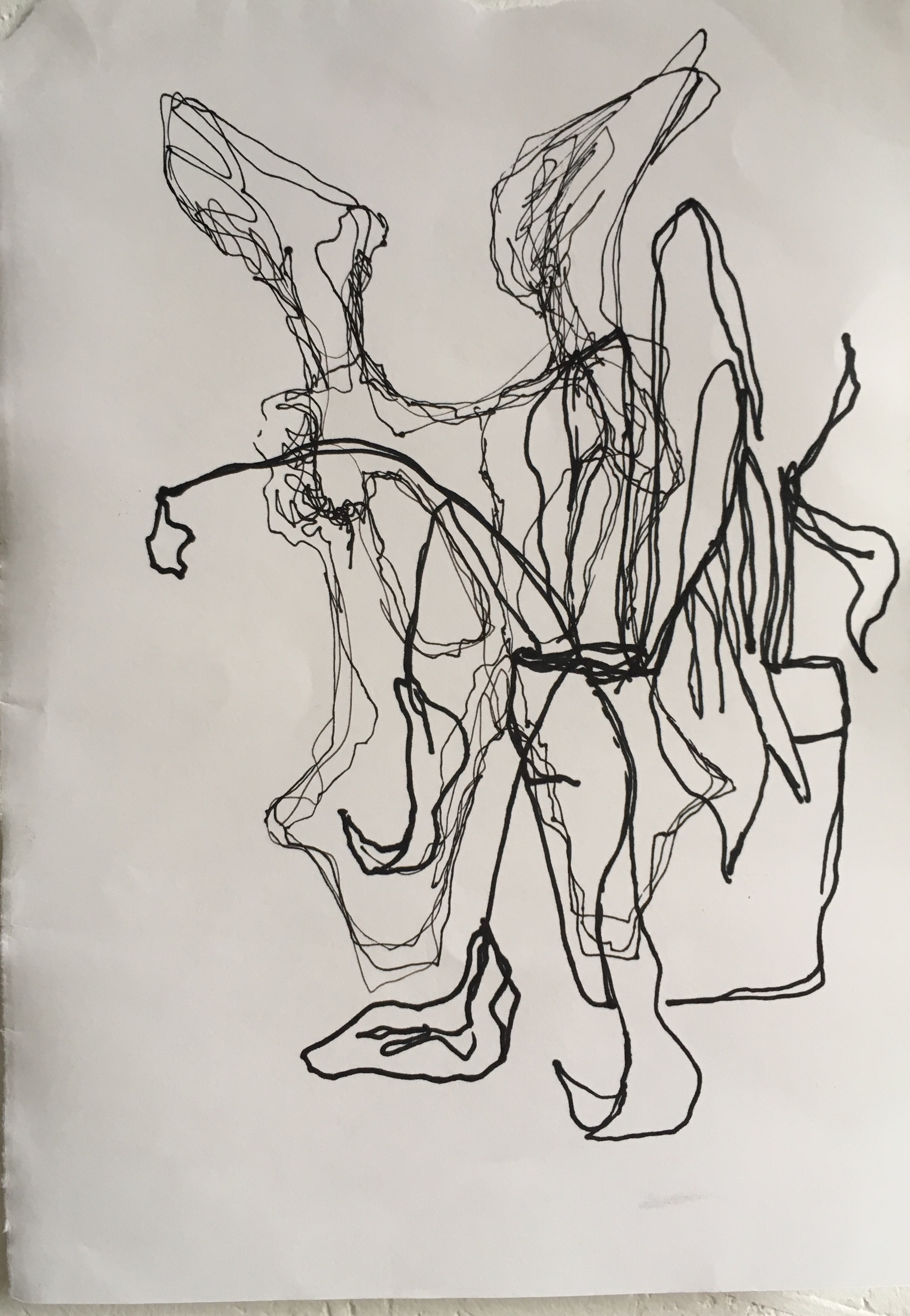
-i love the simplicity of the drawings i feel her decision making of what to show on the paper feels emotive. You can make out recognisable shapes but at the same time i feel she has picked the lines that attract he the most to represent, leaving lots of negative space and room for appreciation for the abstract.
– i feel inspired by what cant be seen in the pictures, i want to created work that doesnt appear to be completed.
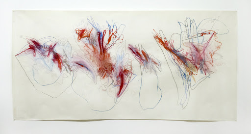
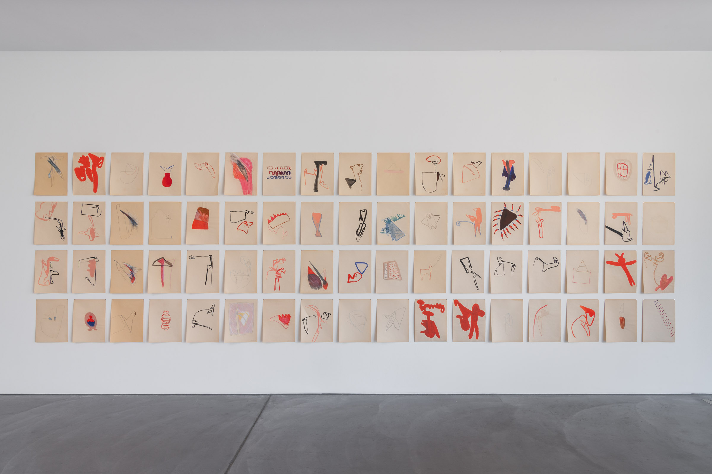
– she created a collection of postcard sized drawings in 1980 called “Bilder zur Lage”, all of the drawings where simple lines and abstract yet as a series came together like an orchestra.
– i like the idea of many drawings of the same subject coming together to look completely different. i also feel that this could help my work by taking the focus away from perfect time consuming drawings.
– the variety of the lines and the size of canvas creates a dynamic dance-like impression, i aim to channel this energy into my work to avoid it feeling so stagnant.
– speaking about her work she says “they literally represented my physical state”…”A reflection of one’s own condition”. This confirms the impression i get from these drawings- she doesnt feel much for representing the subject matter but uses objects as a way to convey her current state.
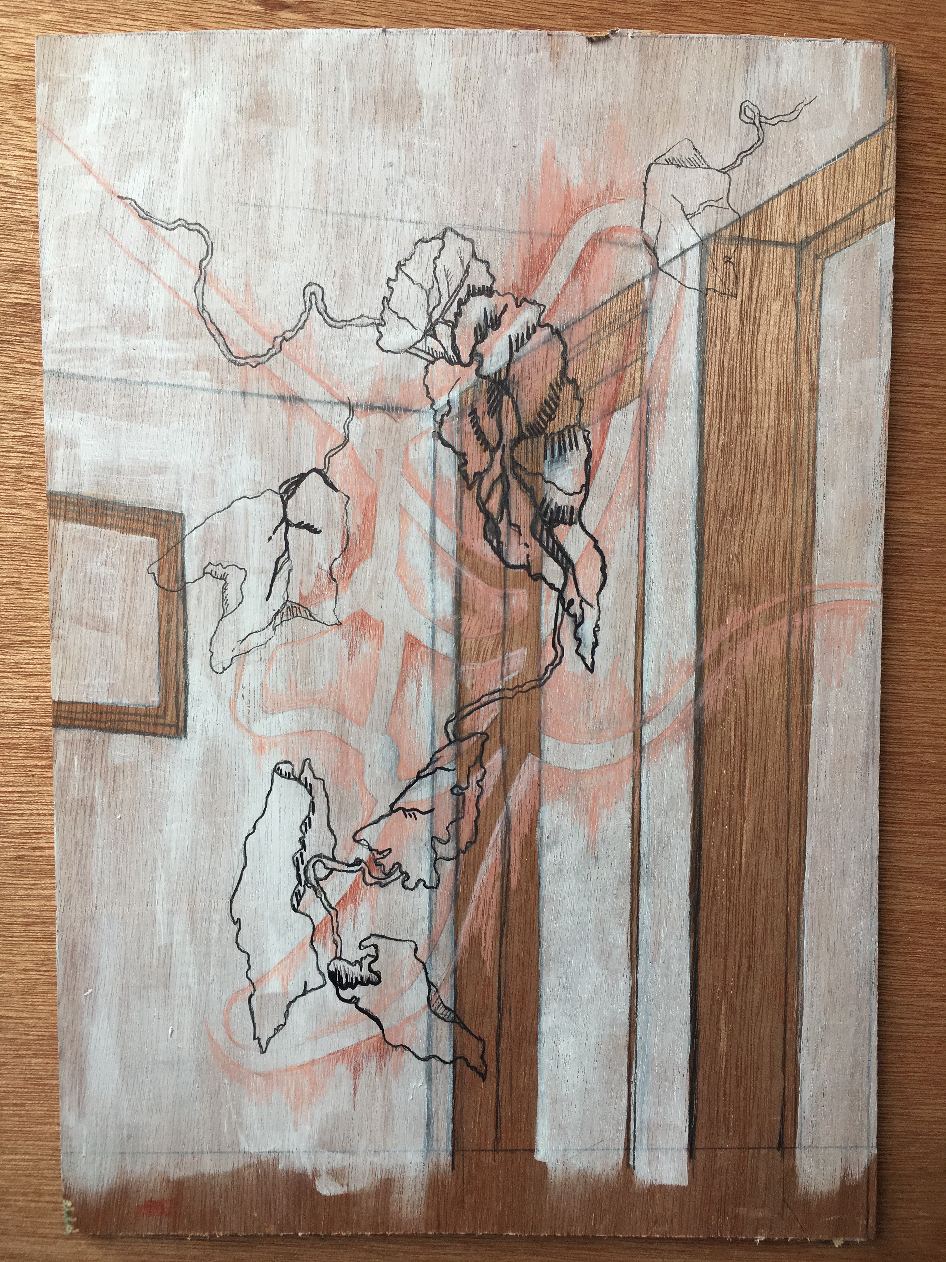
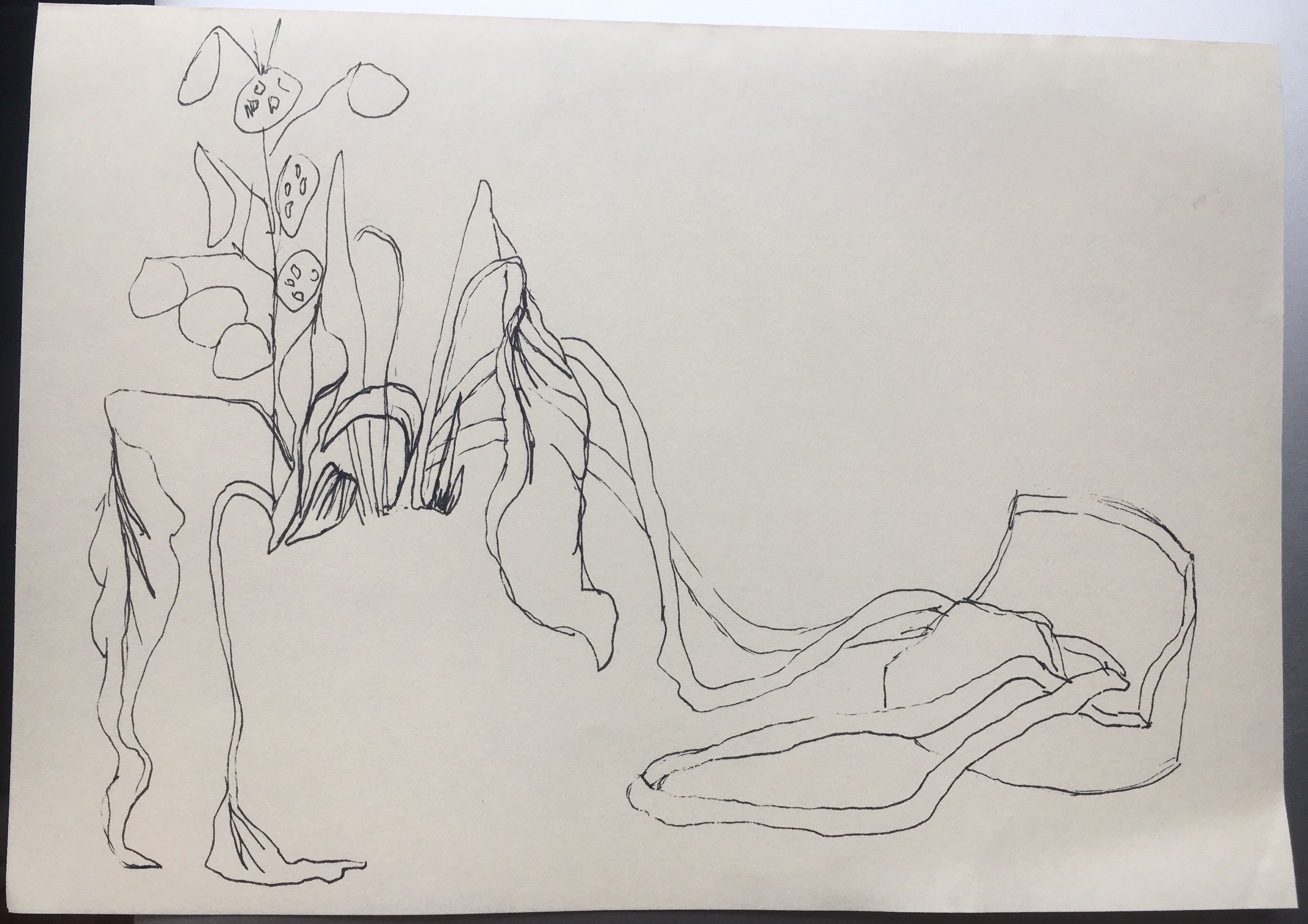
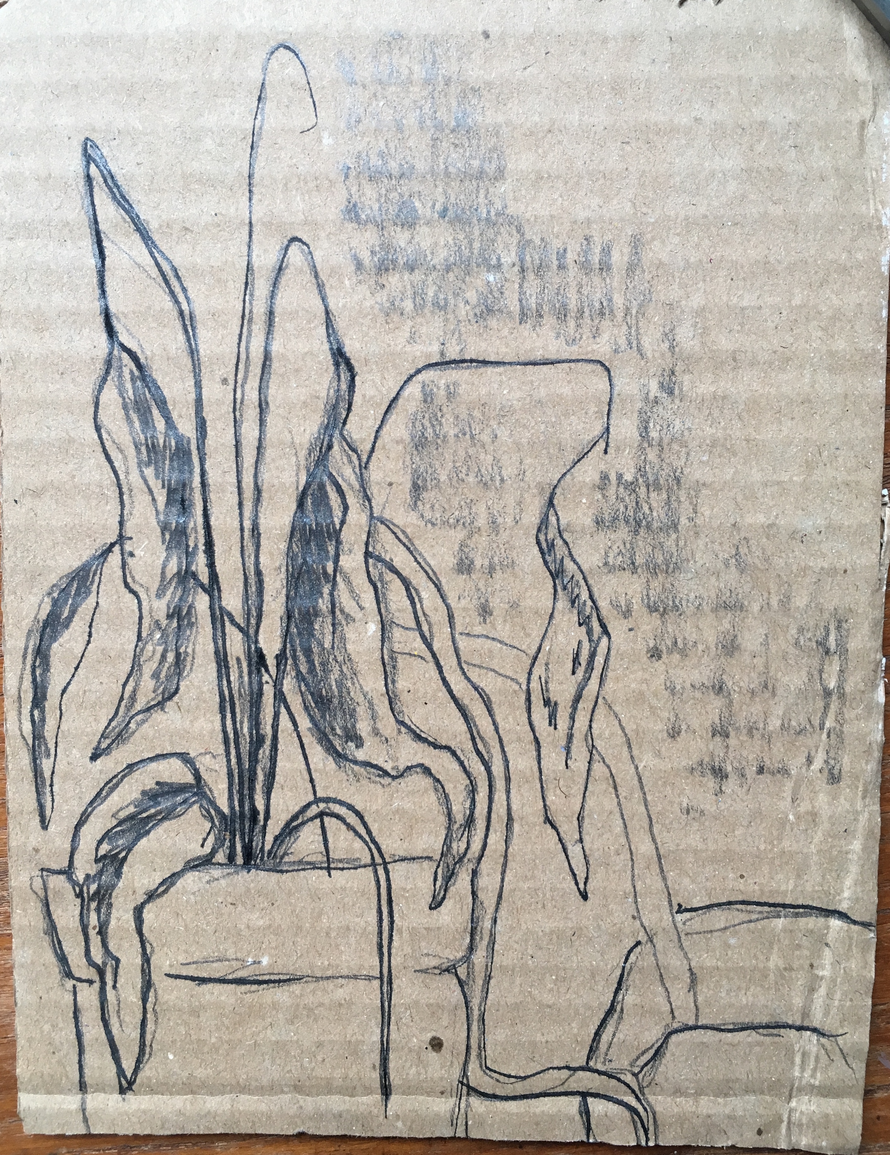
Toba Khedoori

Khedoori was born in 1964, Sydney and received her M.F.A at the university of california in 1994.
– On large (20-30ft) canvases and wax coated paper she explores domestic objects and settings. These impressive works bring charm to seemingly banal and mundane objects.
– There is a contrast between the heaviness of the paper and space it takes up to the delicate lines and details on the paper. A thorough attention to detail is obvious whilst also selective, and in some of the works she draws with painterly qualities.
-I find importance in the way she chooses to take up the paper; rarely filling the whole canvas, the decisive placement conveys a sense of vastness.
-The size of the work forces it to become another room space in itself, it feels far from the feeling you get of a typical drawing on a wall. Although the work is delicate, its presence is anything but.
-The separation of the subject from any form of background creates a structural focus point, it feels similar to the way a sculpture would in a room.
– I love the drawings ability to appear dainty yet limitless, it inspires me to play with scale of the drawing and be more selective of subject matter. The paper that the drawing is on also brings character to the work, there are many imperfections and the fold and tears add so much to it. I want to look at what effect the surface can have on the work and play around with materials to create texture with.

Karla black

Karla Black is a scottish artist, educated at the glasgow school of art 1995-1999.
– Her work is very investigative of the materials she uses. she tends to adopt what comes to hand (toothpaste, hairspray), using her intuition to see outside of typical sculpting mediums- she pushes them to discover all the effects they could possibly give.
-Her work takes influence from the explorative forms that come from sculpture in postmodernism (land art, performance, sound) – she wants to absorb the experimentalism of these mediums but pull it back into sculpture and the focus on aesthetic.
– The colours in her work tend to be very muted pastel colours- i like the way she uses just a touch of colour amongst the surface materials; its something i would like to practice to use colours in less obvious ways.
– she talks about the history of the sculptures she creates- continually building upon happy accidents to become something with many layers. ” the process of painting is the sculpture”. This helps me to be more ok and confident in my decisions; often it takes a long process of decisions before i create. However, i want to start being more instinctive and trust my self to create without second guessing and to be ok with mistakes.
– They way she creates sculpture feels similar to drawing- lots of gesture mark making and direct handling of colours. working into it like you would when drawing. she says she brings the drawing “process into sculpting”. This makes me think about how i can do the opposite- bring techniques of sculpting into drawing- thinking about the lines that can be drawn from sculpture.
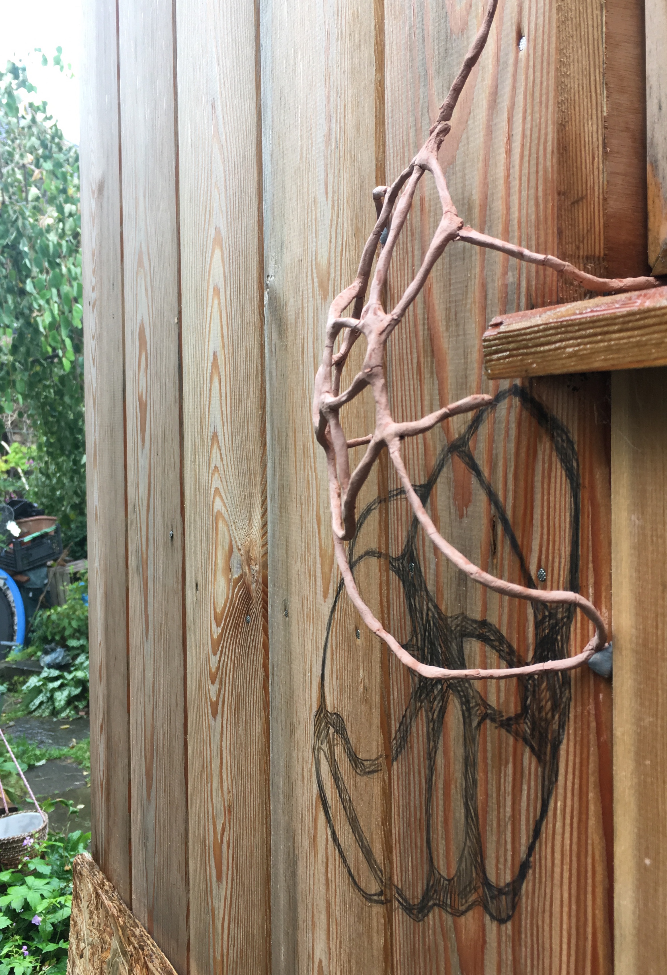
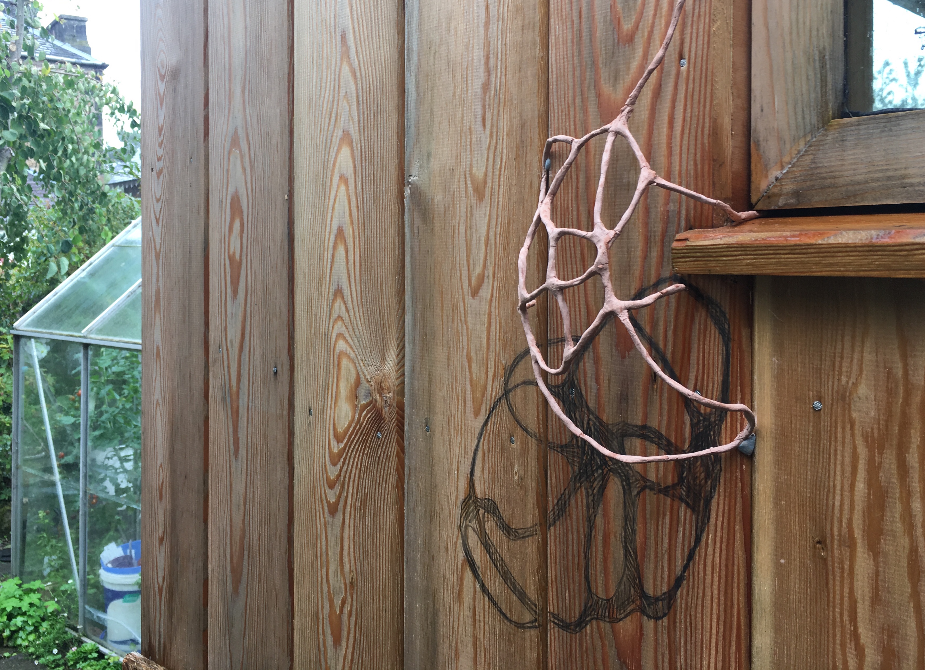
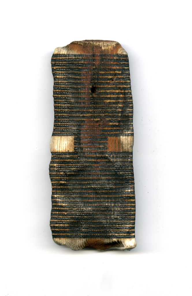
roger ackling

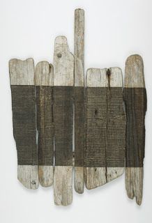
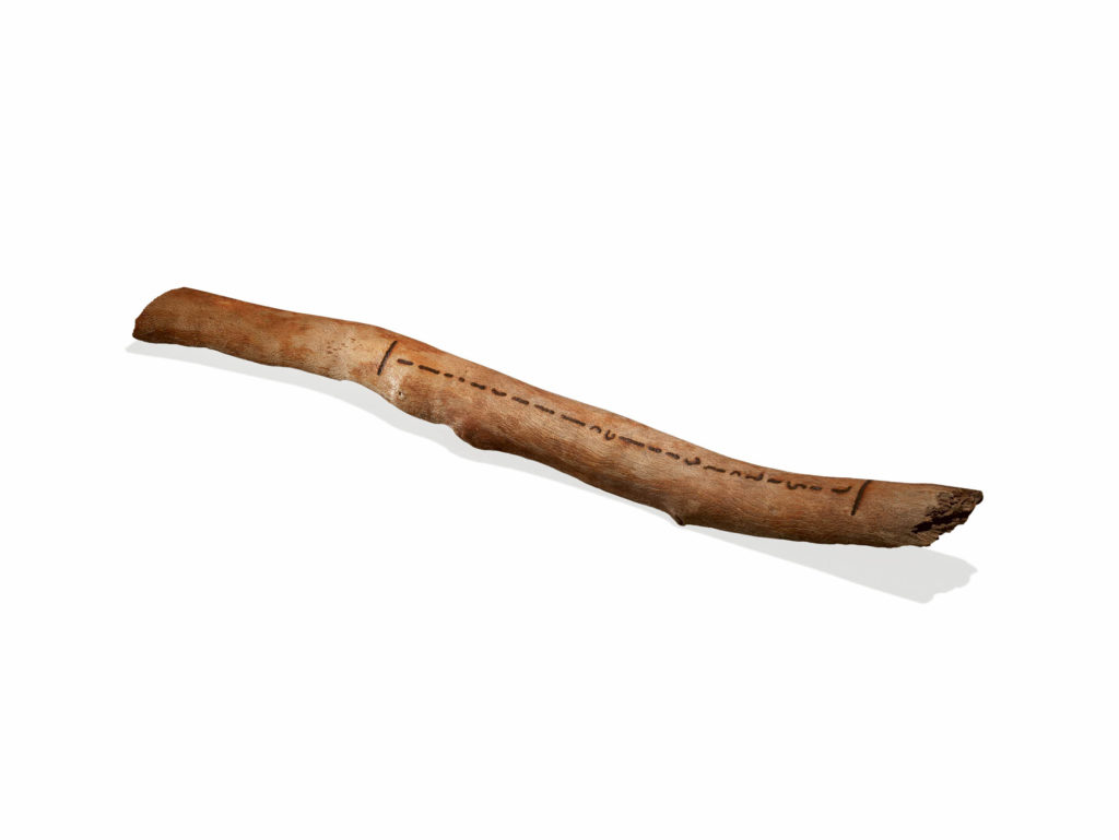
Roger Ackling (1947-2014) was an artist who adopted a very specific technique for all of his art career. —He would use a magnifying glass to draw lines using the light of the sun, he would take his time letting the sun and his surroundings have their impact on the drawings and sculptures. Often you can see in his work where the cloud cover was too thick to be able to create lines or where the shade from branches created a creak in his lines.
– his primary materials were found surfaces usually driftwood or card in a variety of sizes or shapes, sometimes using clothes pegs and picture frames in his sculptures, however he create the drawings exclusively with the sun.
– Ackling said “I usually work from left to right and against the grain.  Each line is made up of many black dots.  Each dot is an image of the sun.” i like the idea that the drawing catches a moment beyond what you can see, the time that goes into it and the environment that they were created in can be seen by the textures and marks on the work.
– His work helped me to think about ways i can use my environment as material and how there is much more than what i can see in a still life in front of me. I find it difficult to create a drawing from a pile of objects, i feel the need to just replicate it and im never sure how to find more interesting ways of portraying it.
-Incorporating my drawings into the environment is my next step. the way he uses only light to make the mark made me think about using shadows and highlights as the drawings themselves. i also want to use natural materials- i can find drawings that the trees have made with their branches and roots, i want to channel this into my drawings to create a connection with my subject.

DEVELOPMENTAL DRAWING- WEEK 2

This weeks task was to complete 20 drawings utilising techniques learnt last week and creating a series of 2d and 3d developments.

I enjoyed that we could blend techniques from sculpture into drawing as 3d is where i feel most comfortable. it allowed me to more thoroughly consider the composition of my drawings and explore what perspectives look interesting. using materials like wire and paper to create a 3d drawing allowed to to question what is and isn’t classed as a drawing.
– i felt incorporating my drawings into the environment allowed me to look a the subject differently- finding lines/drawings created with the branches that were already there.
– the contrast between man made and natural objects is something i will continue to explore, i like the structured shapes of man made subjects and the organic, unpredictable lines of natural ones.
– in these works i specifically like the graphite sticks effect, the rough scratchy shading gives some interesting texture and mimics the feel of shadows well.
– i want to avoid being so literal with the drawings- focussing on what the medium can provide itself will help distract me from trying to replicate what i see.

CRIT ADVICE
-its important that i let myself make mistakes and be more explorative in the earlier stages of drawings.
– keep exploring whether something is finished or not, avoid over working and allow myself to stop before everything i see is in the drawing.
– play around with recomposing shapes and focus on negative space.
– continue folded paper work and look at how sculpture can create line with its shadows.

Developmental Drawing- week 1

I played around with a variety of installations and found these to have the most interesting compositions and shapes to draw. As a class we posted our set ups on mural to allow us to draw from each others: https://app.mural.co/t/learningexperiencetraining5909/m/learningexperiencetraining5909/1600077878254/1233bd88e092a96343047160d5ad63ac834da7c3

SEE YOU SEE ME

This task was to create 8 observational drawings from the installations using monochromatic media.

This task was the first time i had drawn in months so i found it challenging; i started by trying to get an accurate replica of what i saw but after looking at artists such as Marianne Eigenheer, i considered other way to communicate what i saw. I varied the time taken from 2 minutes to 1 hour which helped me relax. I also decided to use scrap paper and alternative surfaces to draw on; i found it forced me to think differently about placing a composition and also how the textures could add to the drawing.

we discussed our work in a group tutorial and created a mural to comment on each others work:
https://app.mural.co/t/learningexperiencetraining5909/m/learningexperiencetraining5909/1600247463063/80e21ffa9e7b816780903f9eaf51974a518b2241

DRAWING FOR DRAWING SAKE

The next task was to make 5 drawings which explore mark making, composition, scale, shape, texture etc. Using only 2b pencil, 3h pencil, ink, fine liner, maker pen, charcoal, rubber, masking tape.

I found the limitations for these drawings difficult, however i enjoyed using masking tape to mark out shapes and create a different surface. Trying to avoid the typical ‘draw what you see’ method i played around with half finished drawings and attempted to include more mark making. i really liked the partially completed drawing as it forced me to stop just before i started to over work the page.

ENVIRONMENTAL DRAWING
Drawing our chosen studio space.

Using similar techniques as the previous successful drawings i continued to play around with surface options. I took time to consider what can be classed as drawing and where that can intersect with 3D; i also enjoyed finding areas in my environment that aren’t usually focussed on, finding lines and new shapes within the space they create. Im starting to understand the relationship between the materials and surface and how an interesting drawing doesnt need to look like exactly like the subject.